‘Living Bright’
AN ODE TO MATTHEW WILLIAMSON
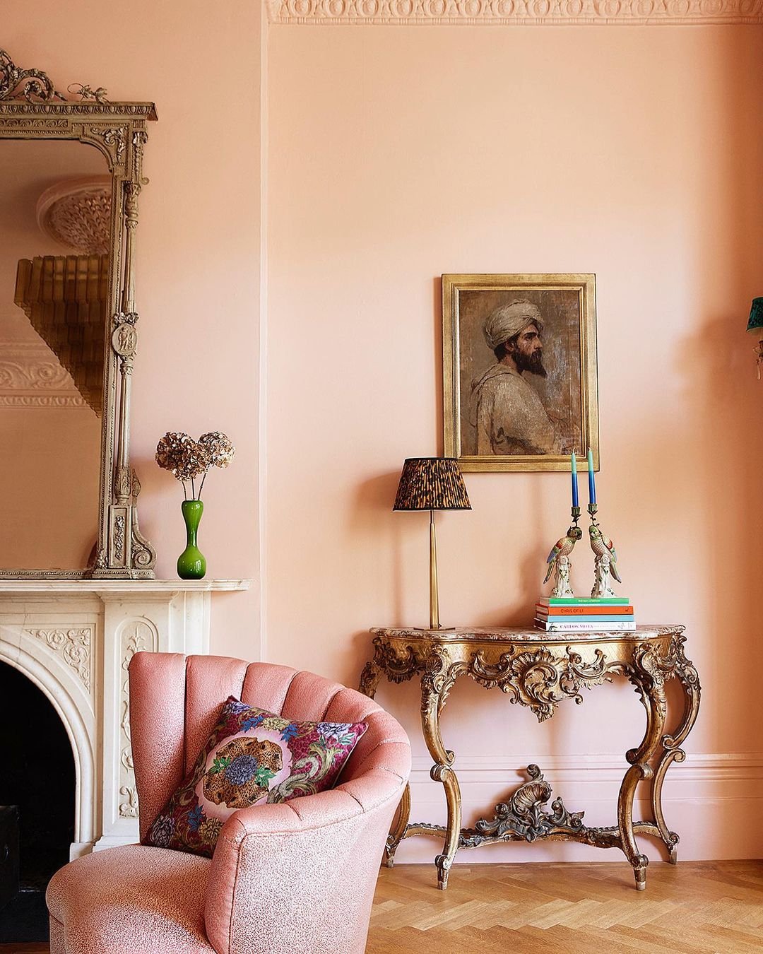
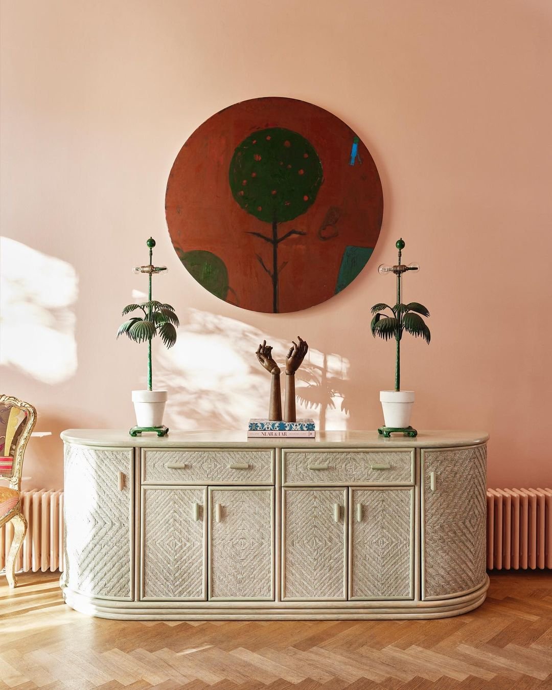
Paint: Lido Pink by The Pickleson Paint Co. | Model: Matthew Williamson | Photography : Sophia Spring
after a week spent sipping sangria…
…On the north-coast of Mallorca, we arrived home to a copy of Matthew Williamson’s new book ‘Living Bright’ perched on our doorstep.
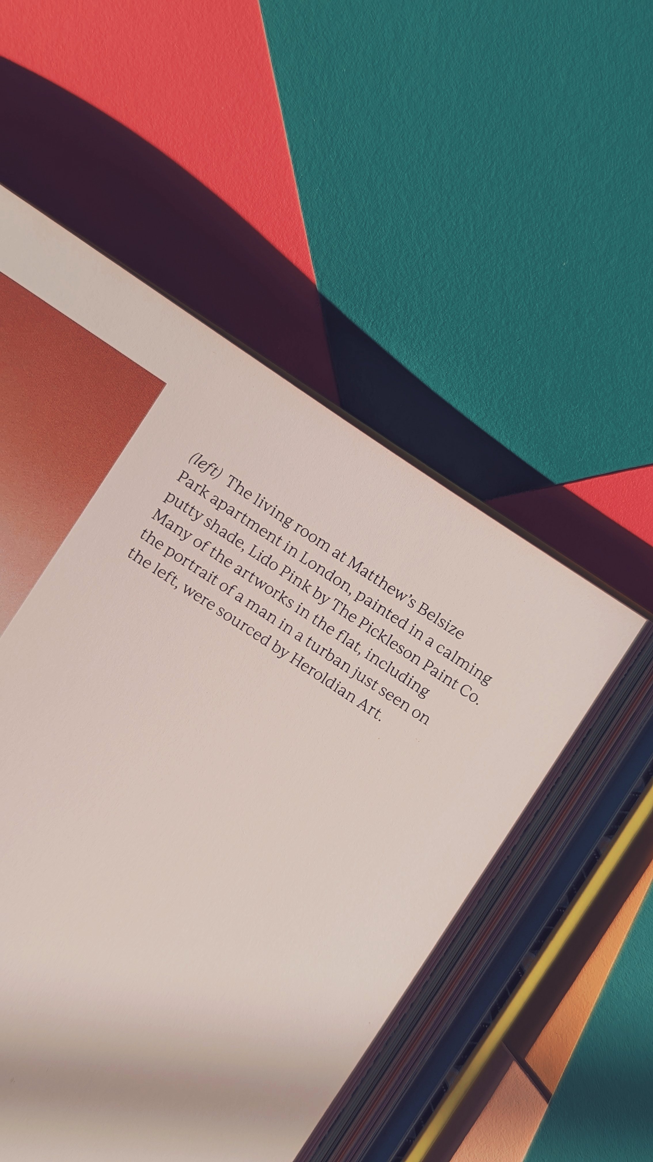
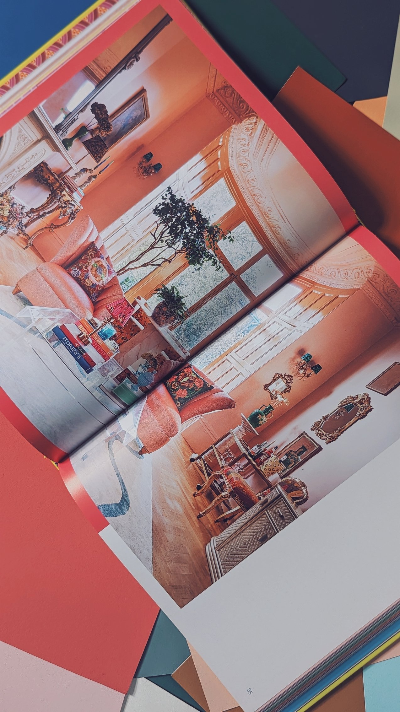
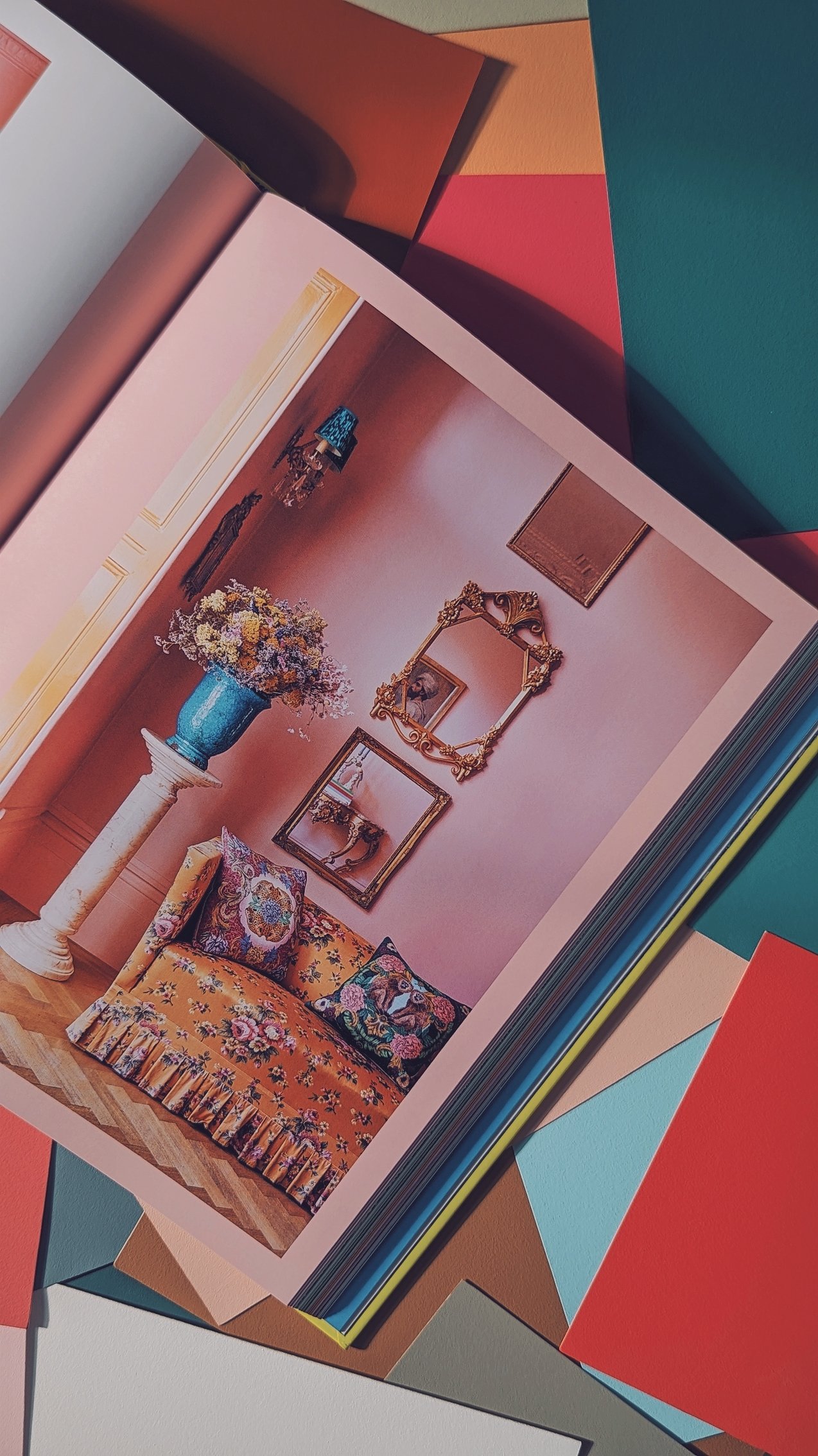
We’ve been excited to get our hands on this journey through Matthew’s life and career - told through the lens of colour - for some time now. Especially since we discovered that an image of our very own Lido Pink, splashed all over the walls of his London living-room had been chosen as the cover girl.
I think it’s fair to say Matthew has done alright for himself… He’s wowed crowds on the world’s runways, made friends with the very sexiest people on the planet, packed it all in to become a wildly successful interior designer and stylist, won accolades, written books, travelled the world, fallen in love, moved to Mallorca, started a beautiful little family and - by the looks of it - has made it to his fifties without even a whiff of a beer belly.
Ordinarily, this would be more than enough success to make one gip and - by proxy - hate him. Instead, his infectious love of design and distinct lack of pretension has seen him trot ever closer towards ‘National Tresh’ terriroty, whilst providing inspiration to the poeple of our dreary little island on how to you use pattern and colour unapologetically and - most importantly - joyfully.
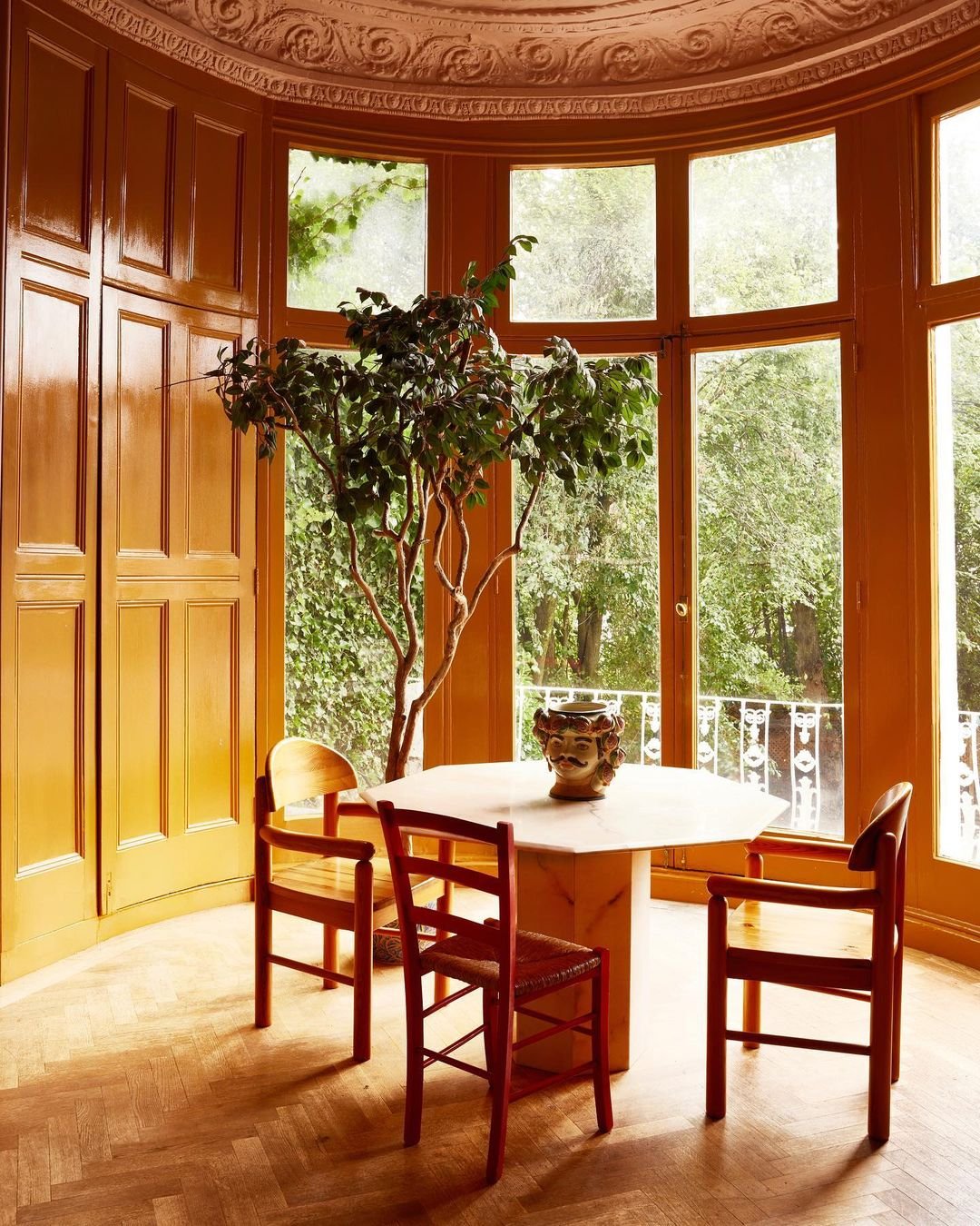
Paint: Lido Pink & Hackney Gold by The Pickleson Paint Co. | Photography : Damian Russell
Our personal love affair with Matthew started in 2022 when, much to our amazement, he posted an image of his London flat, walls adorned in Lido Pink and bay windows plastered head-to-toe in Hackney Gold.
“FUUUUUCK OFFFFF” were the exact words chosen by my sister Holly (affectionately known as Stinky) when we first told her that her great style icon had used Pickleson to paint his palace, which we think is fair enough.
At the time, Pickleson had been going for a year or so and despite some nice online comments, a bit of free press here and there and orders trickling through, we had seen nothing quite like the interest generated by Matthew’s makeover. Lido Pink instantly became our poster child, we started to be asked things like “what colours are going to be big this summer” by national publications and Rachael’s Dad (who hand-paints all of our Sample Cards) had to work over a weekend to keep up with demand.
Since then, Matthew has been consistently kind to us; featuring our colours in his projects, crediting our colours us in interviews and - most recently - dropping us a couple of his mentions in his beautifully written and very handsome new book.
A cliche it may be, but starting a business ain’t easy! It’s difficult to get going when not backed by billionaires and it’s exceedingly difficult to be taken seriously when you have pink tins and write Instagram captions that generally consist of 70s-style innuendos. So then, it truly is a blessing when someone of Matthew’s pedigree and popularity decides to take a punt on you and inspires others to do the same.
So here’s to Matthew, here’s to colour, and here’s to Living Bright.
Thanks, pal x
